Centered Text on Full-Width Slider Section on Squarespace 7.1
If you have started using Squarespace 7.1, I’m sure you’ve tried to add a full-screen slider, only to realize that the text for each image actually appears BELOW the slider, and on over top. Here’s some simple code to adjust that!
Table of Contents
Demo
Here’s what the slider with text will look like once complete.

Step 1 - Create the Slider Section
The first thing you want to do is go to the page where you want the slider and add a new section. In the popup that comes up, click on GALLERY on the left and then pick any of the gallery templates (we’ll be changing this in a little bit).
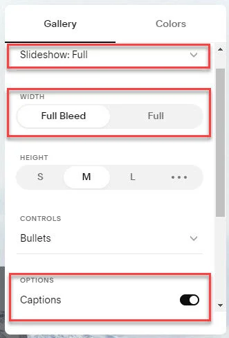
Now when the section is created, click on the dropdown for GALLERY TYPE and pick Slideshow: Full. Now make sure the WIDTH is set to Full Bleed. And finally, set the OPTIONS to have Captions enabled.
** Optional: You can turn on autoplay if you’d like, otherwise people will navigate using arrows on the side, or the bullets on the bottom **
Step 2 - Adding the Wording
Now we’re going to close the popup from Step 1 and click on the gallery icon.

Upload all the slider images you want by clicking the + sign on the left of the popup, and click on each image and enter the DESCRIPTION you want.

Step 3 - The Code to Move the Text
Now save or publish your page and click the GEAR icon that appears when you hover on your page title on the left. Click on Advanced and then copy and paste the following CSS into the PAGE HEADER CODE INJECTION section. Feel free to change the font size and color as needed (the code is commented so you can find the code for it).
<style>
  /* Change font size of text */
  .gallery-caption p.gallery-caption-content{
    font-size: 4rem;
  }

  /* Change font color of text */
  .gallery-caption p.gallery-caption-content{
    color: white !important;
  }

  /* Make font smaller on large tablet and mobile */
  @media screen and (max-width: 1907px) and (min-width: 0) and (orientation: portrait)
  {
    .gallery-caption p.gallery-caption-content{
      font-size: 3rem;
    }
  }

  /* Center slideshow vertically and horizontally  */
  .gallery-caption-fullscreen-slideshow{
    position: absolute;
    top: 50%;
    left: 50%;
    transform: translate(-50%, -50%);
  }

  /* Remove bottom margin so the next section doesn't have too much space */
  .gallery-fullscreen-slideshow[data-show-captions="true"][data-width="full-bleed"] {
    margin-bottom: 0px;
  }

  /* Add in a background color behind the text if needed */
  .gallery-caption-fullscreen-slideshow{
    height: unset;
    background: rgba(0,0,0,0.5);
    margin: unset;
  }
</style>